The Durmart Brand Identity Redesign project represents a comprehensive rebranding effort for a prominent family-owned supermarket chain in Kosovo. Combining the Durmishi family name with “Mart” for market, Durmart’s new identity emphasizes strong family values, commitment to community, and the mission to provide fresh, essential products for everyone.
Logo
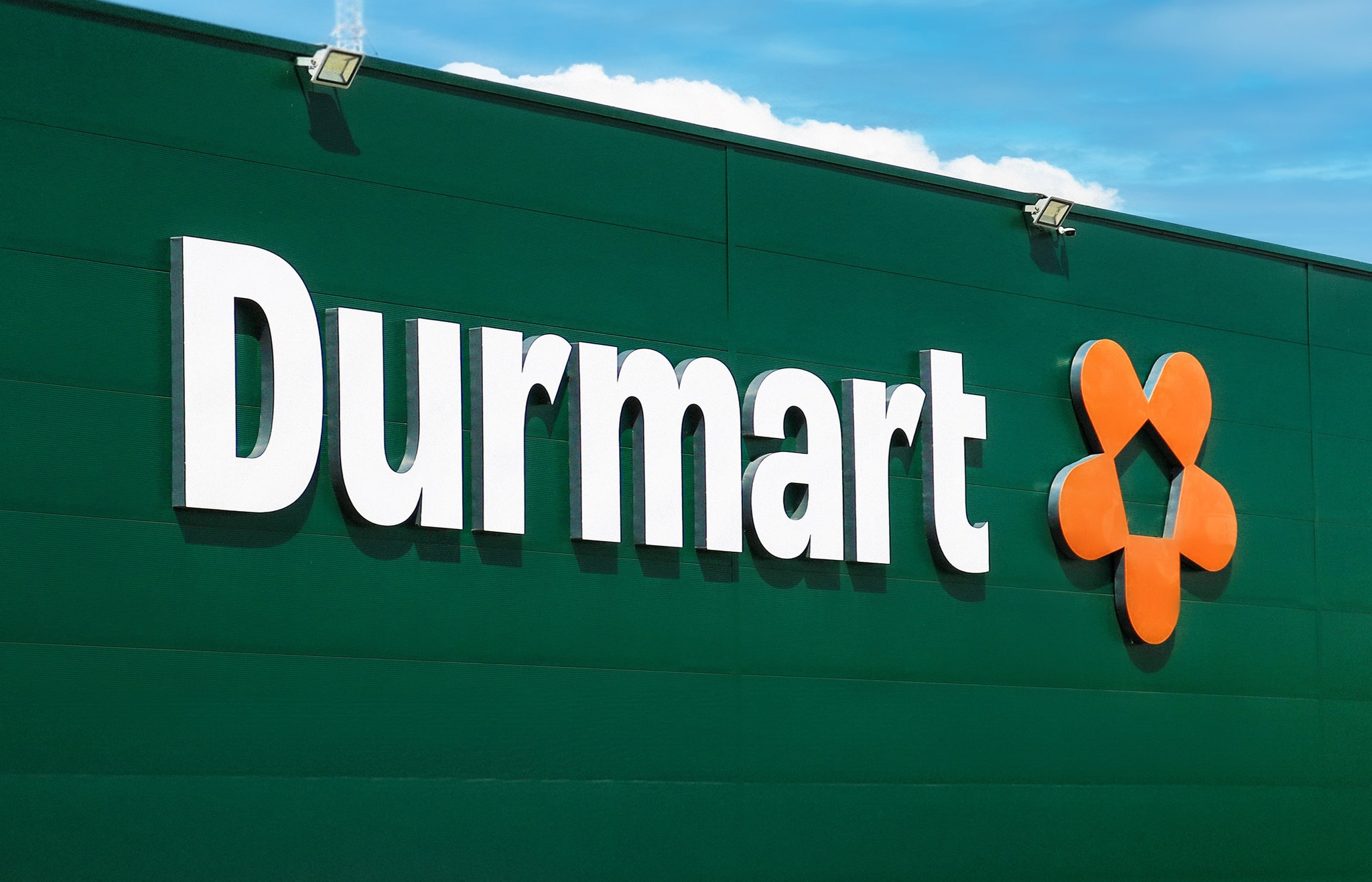
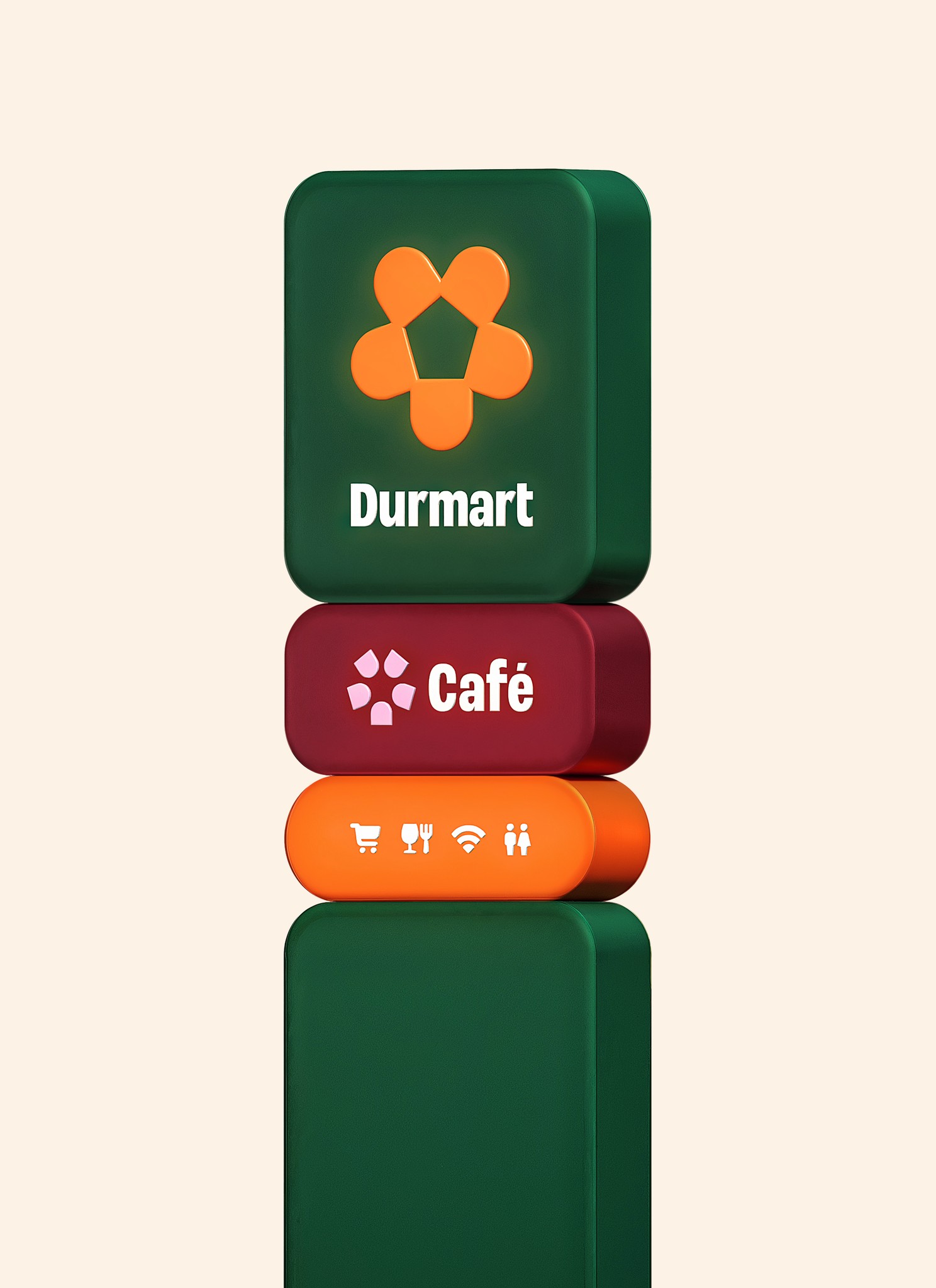
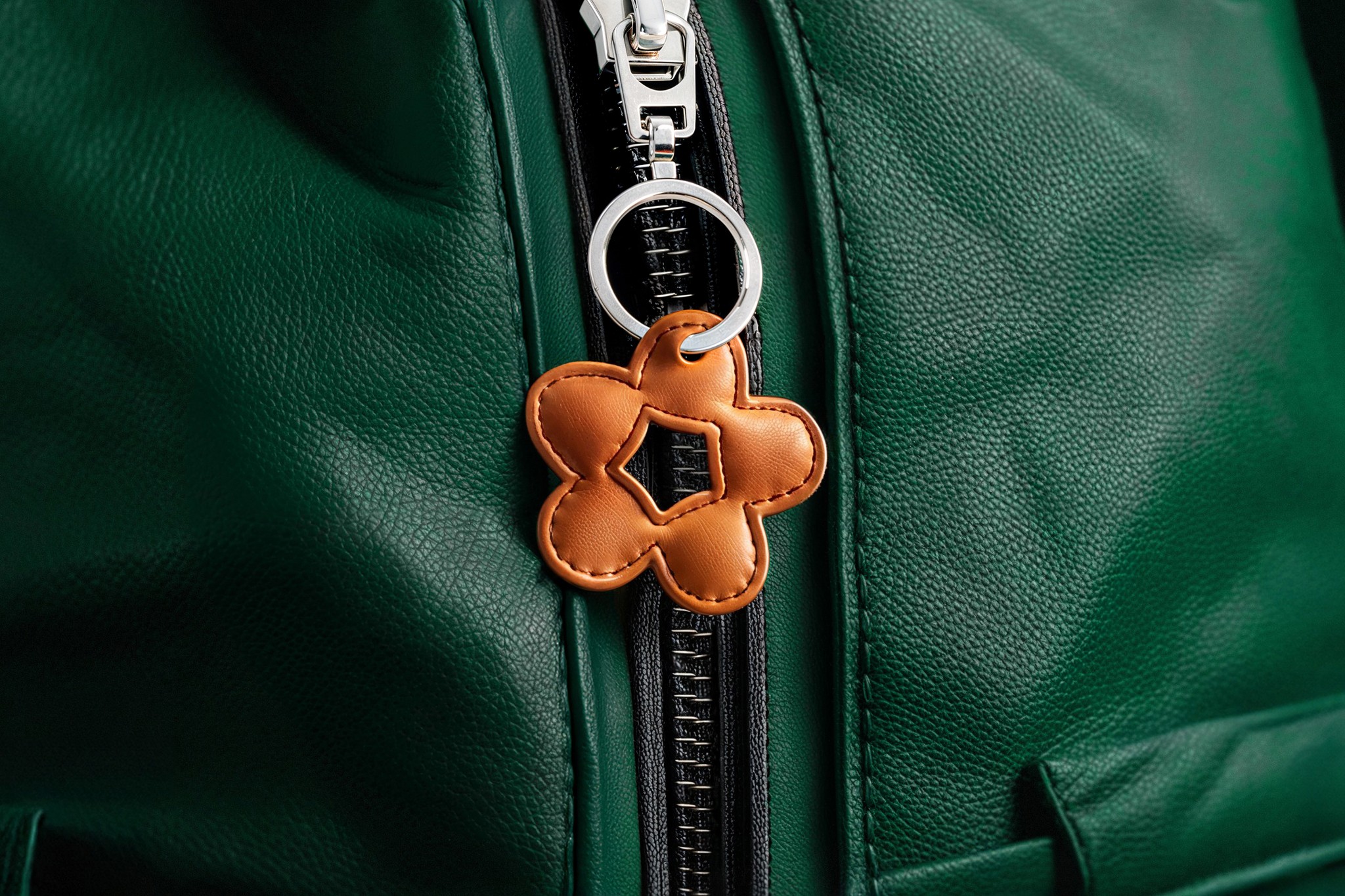
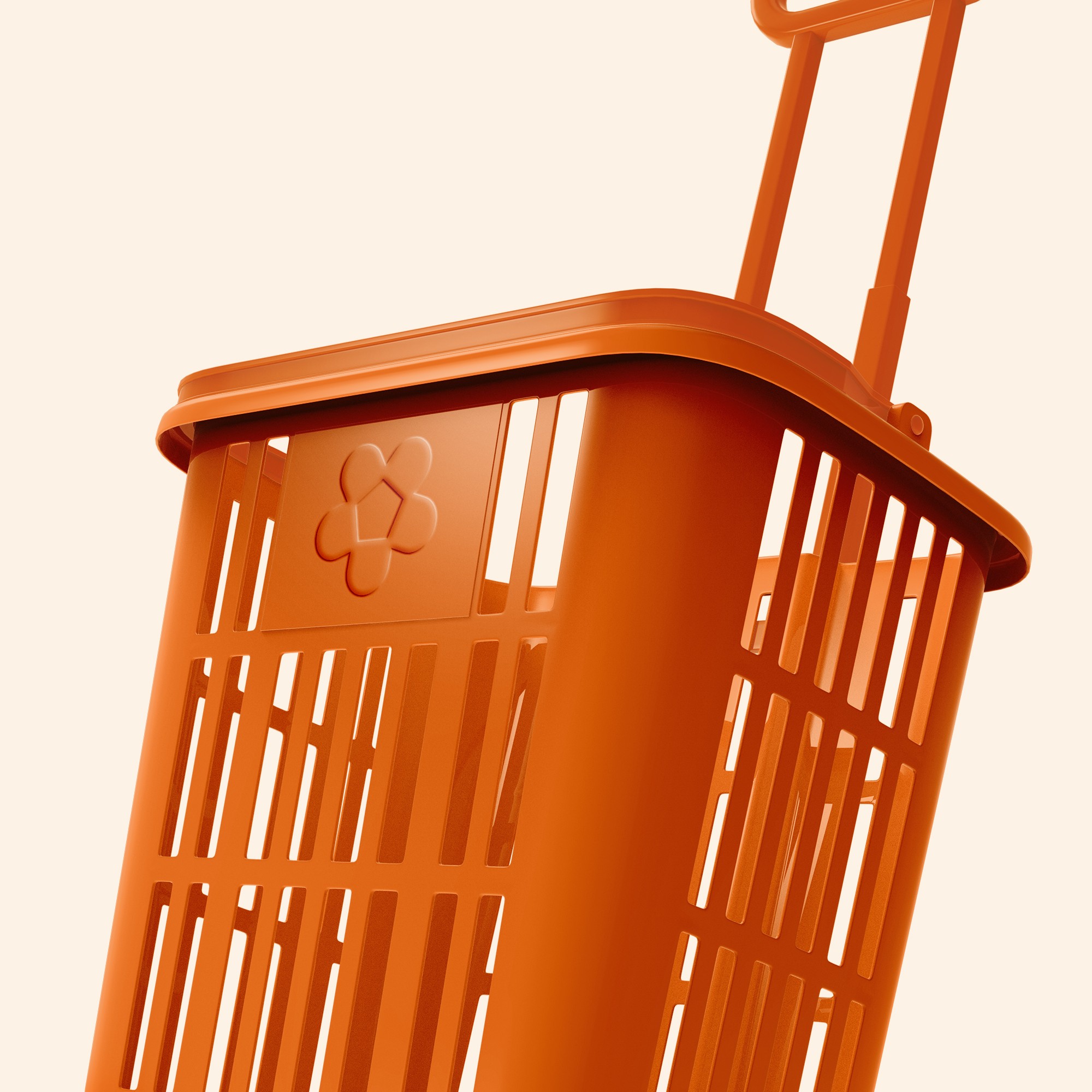
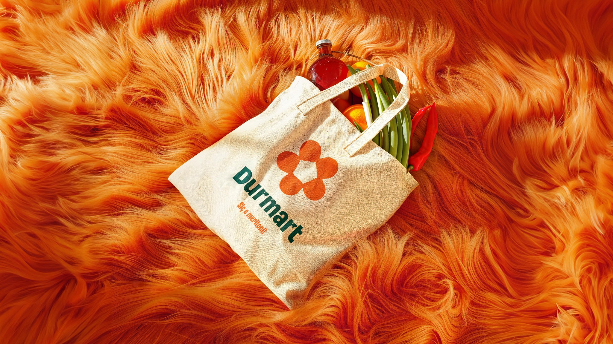
The logo is composed of five D’s representing the five members of the Durmishi family, with a house symbol in the negative space, symbolizing that Durmart is more than a store—it’s a place that fulfills all your home and life needs.
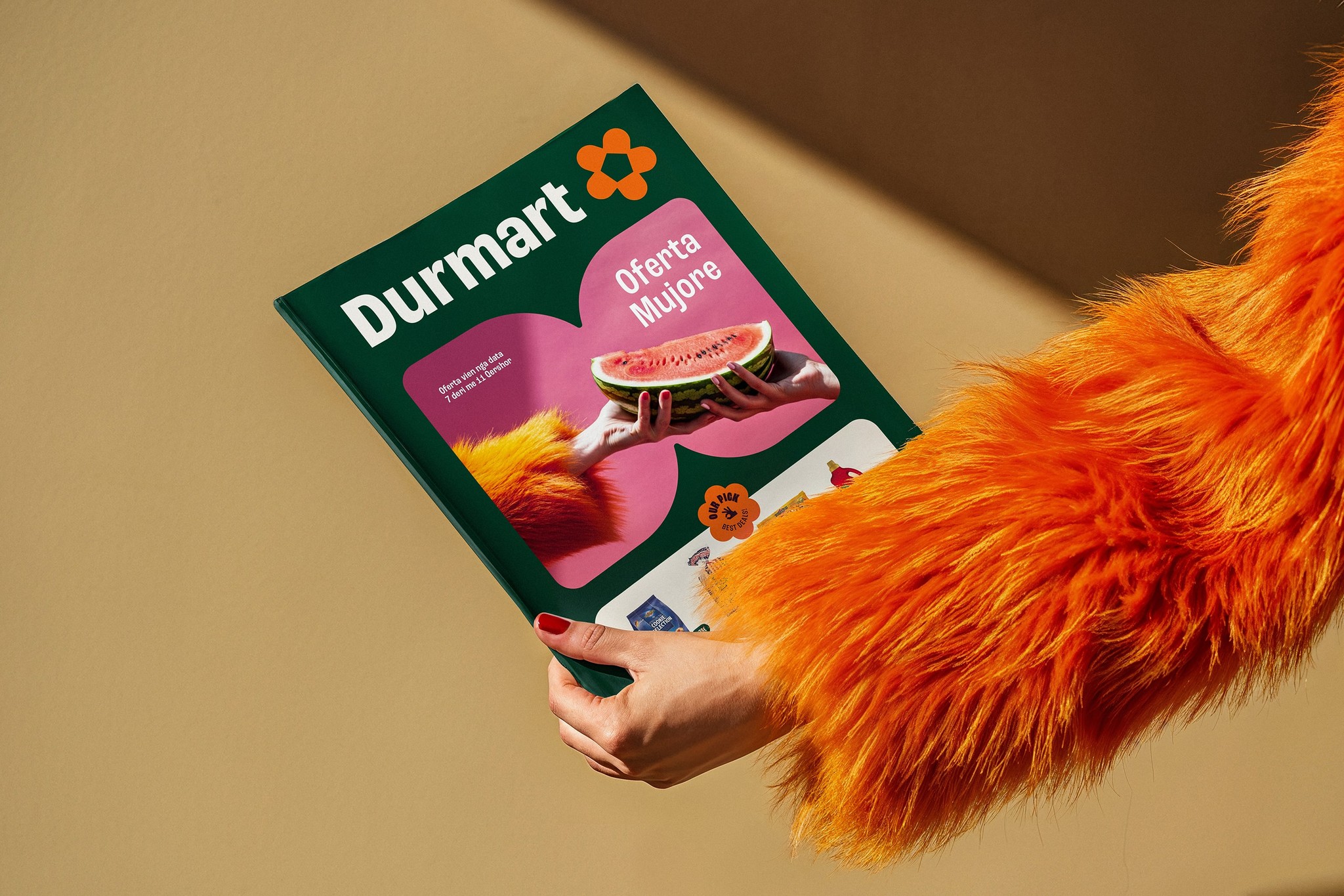
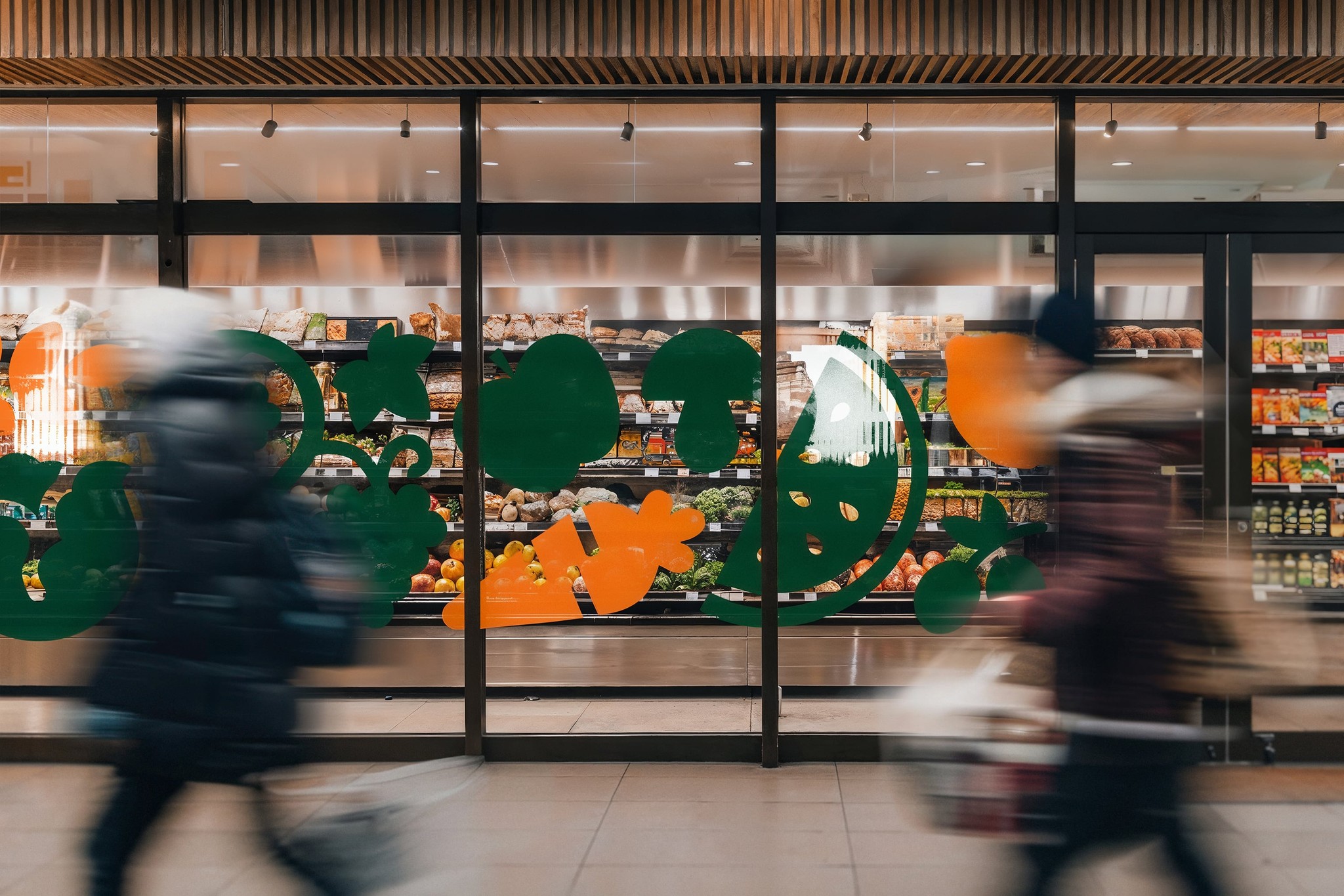
The rich color palette, friendly typography, and cohesive visual elements are designed to create a welcoming and memorable customer experience, reinforcing Durmart’s position as a trusted and essential part of the community. Through thoughtful design applications, vibrant imagery, and dynamic motion graphics, the new Durmart brand identity is poised to leave a lasting impression.
